
The ultimate guide to driving more sign-ups with an emotion-led SaaS pricing page
- 1. Emotion outperforms logic. Every time (and I’m going to tell you why.)
- 2. But does emotion actually work in marketing?
- 3. Let’s take a moment to talk about decisions
- 4. The role of emotion in decision-making
- 5. The scientific evidence behind why (and how) emotion outperforms logic
- 6. So, what does this mean for your pricing page?
- 7. The science is clear. Emotion is “stickier” than simply stating facts.
- 8. And SaaS brands are already proving the power of emotion
- 9. The logical flow of most pricing pages
- 10. The problem with logic-led pricing pages
- 11. Moving to an emotion-led pricing page
- 12. Why emotion-led pricing pages work
- 13. The benefits of weaving emotion into your SaaS pricing page
- 14. How to create an emotionally charging pricing page
- 15. Examples of emotion-led pricing pages in the wild
- 16. Use these AI prompts to bring emotion into your pricing page copy (without sounding robotic)
- 17. Remember: Swap logic for emotion if you want to drive more SaaS subscriptions
TL;DR: Just tell me how to make an emotion-led SaaS pricing page that converts
Here’s the whistlestop tour of how to build a pricing page that connects and converts:
- ✓ Use psychological triggers in your copy to motivate action
- ✓ Conduct user research and put their words at the heart of your messaging
- ✓ Design for emotional impact, making sure your words and visuals work together
- ✓ Build trust with social proof like user logos, testimonials, or spotlighted case studies
- ✓ Pinpoint common objections and use a guarantee or offer to overcome those hesitations
You can still have a logical page structure, just strategically weave emotion throughout it to guide users along the journey to signing up
Emotion outperforms logic. Every time (and I’m going to tell you why.)
I know what you’re probably thinking, “You’re a copywriter, Tasmin. You work in marketing and write creative words all the time. Of course, you’re going to say emotion is better than logic!”
You’re right, I work in marketing. And I write words. But I don’t necessarily think what I do is creative.
In fact, I’d like to play devil’s advocate here by arguing that copywriting (and marketing, in general) is much closer to a science than a creative art.
There’s formulas, frameworks, theories, data… Heck, there are hypotheses and experiments. It is so scientific.
As for the role emotion plays, there’s also psychological and scientific proof that emotion has a far greater impact on decision-making than logic.
See… it’s science!
And this doesn’t just apply to copywriting, design, or marketing. It applies to user experience (UX) and conversion rate optimisation (CRO) too.
More than that, it applies to everyday life. It applies to each and every decision you make… including the ones you don’t even know you’re making.
If you haven’t guessed, I’m passionate about this. Really freaking passionate. Because this stuff has the power to move mountains for your business.
I know the word gamechanger gets thrown around. But, this… this is a gamechanger.
Learn how to lean into the emotions of your target audience, and you’ll learn how to raise sign-ups.
But does emotion actually work in marketing?
If you’re wondering “does emotion actually work in marketing?” then the short answer is yes.
The long answer is yes, it abso-freaking-lutely does. Time and time again, we have seen companies use emotion to increase their marketing success rates, win awards, and create memorable brands.
Take charity marketing ads, for example. They tug at your heartstrings because they know it makes you far more likely to dig into your pockets and donate to their cause. Charities know that evoking an emotional response encourages people to take action.
Emotional marketing doesn’t just work on altruistic folk. It works just as well on people who donate to charity to feel good about themselves. So, tugging at people’s emotions in your SaaS copy can make them feel better about themselves.
And charities aren’t the only ones who win with emotional advertising.
A Harvard Business Review article noted:
“After a major bank introduced a credit card for Millennials that was designed to inspire emotional connection, use among the segment increased by 70% and new account growth rose by 40%.”
Then think about Duolingo — a language-learning app that has a cartoon owl as its mascot. Duolingo humanised its brand through Duo, its owl mascot. Since then, they’ve created a whole series of viral (and rather unhinged) marketing content that continually cultivates an almost cult-like following.
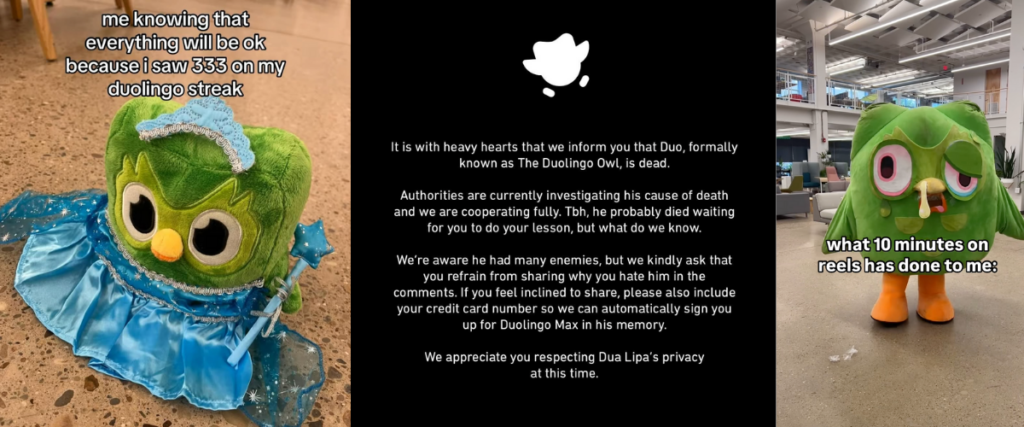
This humanisation of Duolingo resonates with people and evokes emotions by creating an immersive, personable experience. It either has you rooting for Duo or feeling absolutely bewildered. Either way, it makes you feel something. And it makes you remember Duolingo.
Side note: You don’t need to go down the unhinged route to make people feel something. You can make your SaaS tool feel more personable by digging into voice of customer data and pulling those customer emotions, motivations, and experiences to the front of your marketing messaging.

Now, let’s throw it back to 1981 when LEGO decided to stop using their advert to sell toys and instead use it to sell a feeling.
They sold the outcome of buying LEGO — which is exactly what your pricing page should do for your tool, by the way. It should sell the outcome, not the tool itself.
So, there you have it. Just a few examples to show that yes, emotion does work in marketing.
Flipping this over to your SaaS pricing page. You might think the job of your pricing page is to sell the tool. It’s not. The job of your pricing page is to sell the final outcome. It’s to sell that one thing your tool does for your audience that they really desire.
Before we get onto the power of emotion for SaaS pricing pages, I want to make sure we’re all fully up to speed on why emotion matters.
Let’s take a moment to talk about decisions
Do you want chocolate or chips? Would you rather have $1 or $10,000 — no catches?
Some decisions we can make with a click of a finger. We instantly know what our answer would be without having to give it a second thought.
The reason we can make some decisions automatically is because we’ve been priming our brains for years, allowing us to build mental shortcuts to guide our decision-making.
Whenever we make a decision, we draw upon our mental models — AKA we use all the worldviews, concepts, and frameworks we’ve learned throughout our lives to make sense of the world around us. This allows us to make new decisions faster by pulling from the context and past experiences we already have.
Decision-making isn’t always so clear-cut. Some decisions require more thought. When faced with a big decision, we may want to spend more time gathering facts and information to help us make informed decisions.
We also make some decisions based on our intuition. We can get a gut feeling about something and use that to guide what route we go down. We might decide something without fully thinking about the outcome or the consequences.
Whether we’re thinking fast or slow, our decision-making process is impacted by a multitude of factors — our past experiences, cognitive biases, emotions, values, situational context, influential authority figures, societal pressures…
While there are many factors at play, there’s one factor that often outperforms them all.
I’m sure you can guess what I’m going to say.
Emotion.
The role of emotion in decision-making
If you think people decide to buy your SaaS tool based purely on logic, think again.
Research shows that emotion plays a starring role in every decision we make. Even when it feels like we’re logically weighing up the pros and cons, our emotions are working quietly (and sometimes loudly) behind the scenes to guide our choices.
When a prospect lands on your SaaS pricing page, they’re not just asking themselves “How much does it cost?”, they’re also feeling out questions like…
“Will this save me time?”
“How will it improve my life/work/day?”
“Will I feel good for choosing this?”
“…What if I regret it?”
According to the emotion-imbued choice model by Lerner et al, there are two big emotional forces at play:
-
- Expected emotions – What they predict they’ll feel after choosing your product (relief, excitement, pride… or regret if they get it wrong).
-
- Current emotions – How they feel right now while looking at your pricing page. If they’re excited and happy, they’ll likely convert faster. If they’re stressed or overwhelmed, they might hesitate or bounce.

Things like personal traits (like being naturally cautious or impulsive), how easy your pricing is to understand, and even random stuff like whether they’ve had a bad day can all stir up emotions that impact their decision-making in the moment.
Even the process of making a decision can trigger emotions. If a choice feels easy, we might feel relief. If it feels hard or confusing, we may experience choice overload, leading to feeling overwhelmed and unable to take action.
Our brains jump around here, there, and everywhere when we weigh up our options. The emotion-imbued choice model does a good job of showing how it’s not just about what we think, but also about how we feel.
On top of all that, people will also use emotion to explain why they did something after the fact. This phenomenon is known as “choice-supportive misremembering” or “retrospective rationalisation.” Essentially, people will justify their actions by referring to emotions they felt at the time, even if those emotions weren’t knowingly present during the initial decision-making process.
In short: logic justifies a decision. Emotion drives it.
Your pricing page shouldn’t just make sense. It should make people feel good, excited, and confident about saying yes.
The scientific evidence behind why (and how) emotion outperforms logic
Charles Darwin was the ultimate scientist. But even he couldn’t logic his way out of fear.
In the 1870s, Darwin put his own emotions to the test.
Every day, he’d go to the Reptile House in the London Zoological Gardens. Here, he’d press his face up against the glass of the puff-adder’s housing, bracing himself not to react. Logically, he knew the thick glass protected him. Yet every time the snake struck, he jumped back in fear.
As Drawin himself put it, his “will and reason were powerless against the imagination of a danger which had never been experienced.”
This small self-experiment hints at a huge truth: emotion overrides logic, even when we know better.
Just like your customer knows they should probably compare features or read FAQs. But their emotions will decide whether they click that shiny “sign up” button regardless of any logical steps they take.
And modern science backs it up.
Take the case of Elliott, a real patient studied by neuroscientist Antonio Damasio. Elliott had life-saving brain surgery that removed a part of his brain that was responsible for emotion.
While Elliott’s recovery seemed perfect, there was just one issue.
He was still sound of mind when it came to intellect and logic. But, without emotion, he simply couldn’t decide anything.
No feelings, no choice.
Damasio’s research led to the “somatic marker hypothesis” — a psychological theory that suggests emotions act as shortcuts that guide us toward action. Without these emotional signals (be it fear, excitement, or desire), we stall, freeze, and walk away.
See, we’re feeling machines… Not thinking machines.
Pretty compelling research into the impact of emotion on decision-making, eh?
So, what does all this mean for your pricing page?
Sure, you can load your pricing page with logical comparisons, tables, and feature lists.
But if you’re not making people feel something, you’re asking them to make a purely rational decision. And rational decisions get delayed or overanalysed.
Emotional ones? They spark immediate action.
Creating an emotion-led pricing page isn’t just about avoiding fear or friction. Feeling good matters too.
According to psychologist Barbara Fredrickson’s broaden-and-build theory, when people experience positive emotions (like excitement, hope, or relief), their minds broaden. They take in more information, see more possibilities, and become more willing to act.
On a pricing page, making someone feel optimistic or excited about their future with your product doesn’t just lift their mood. It literally widens their thinking. It helps them imagine their future success and say yes more easily.
Positive emotion = broader thinking = faster, more confident decisions.
Emotion also appeals to our “dog brain.” Our dog brain, or “mammalian brain” as you might have heard it called, is the part of our brain that’s responsible for things like our emotions and social interactions. Speaking on the mammalian brain, Chase Hughes, an Intelligence Behaviour expert, states we need to “pierce the barrier from the logical to the mammalian brain if we want to persuade people to take action.”
The science is clear. Emotion is “stickier” than simply stating facts.
In their book Made to Stick, Chip and Dan Heath ran a study where students gave short pitches. Some were loaded with statistics, others were told through personal stories.
When later tested on their recall, 63% remembered the stories, while only 5% could recall any statistic.
Why? Because emotion hooks memory. We rarely remember what’s logical. We remember what made us feel something.
And SaaS brands are already proving the power of emotion
Basecamp has long paved the way for showing what great copy looks like in SaaS. They build great products (in my opinion) and they relentlessly test, innovate, and improve. As they famously put it, “Good writing is good design.”
Basecamp sees the voice of their product as a living, breathing part of the customer experience. Whether you intentionally create it or not, “your product has a voice — and it’s talking to your customers 24 hours a day.”
Even today, their co-founder Jason Fried actively experiments with emotional messaging on their website, continually searching for words that resonate most with visitors and drive sign-ups.
Intercom understands that storytelling builds connections, not a dry list of features. They recognise that stories are an essential part of building trust and encouraging conversions. Reflecting on the power of storytelling in live chat sales, they state that “stories help you build trust by communicating value in ways that people are known to respond to.”
Intercom’s approach to content and messaging is rooted in creating genuine emotional engagement. Their pricing pages, blog content, and product marketing all show how emotion-led storytelling drives action better than features alone. They put it best themselves when they said:
“The idea is that by using empathy, strong opinions, an established tone, and real, relatable experiences and advice, your content will ignite something that goes beyond a business/customer relationship.”
And because all good things come in threes, Laura Elizabeth, the founder behind SaaS products and courses like Design Academy and Client Portal, always puts customer experiences at the heart of brand messaging.
Instead of inventing emotional messaging or focusing on features and benefits, Laura reflects her customers’ real frustrations back to them to create instant empathy and connection. And it works. In a podcast interview, DesignAcademy’s founder, Laura Elizabeth, shared how this method of collecting real frustrations gave her a “really good idea of what Design Academy was going to be.”
The logical flow of most pricing pages
Let’s be real for a moment. A lot (and I mean a lotttttt) of SaaS pricing pages follow the exact same boring, logical structure.
You know the one.
It’s your typical SaaS pricing page flow that looks like:
-
- A generic pricing plan headline (“Choose the plan that’s right for you”… total yawnfest, am I right?)
-
- A tidy pricing table listing the features and cost
-
- A social proof bar packed with company logos
-
- Maybe some FAQs about the product chucked in at the end
-
- …and that’s it
It’s logical. It does a great job of running through a checklist of things you might want to know before signing up.
(Price? Check! Features? Check! Used by other companies? Check! Quick answer to that oen random question you had? Check!)
But logical doesn’t mean persuasive.
A page like this might inform people, but it doesn’t move them to take action.
And it’s not just a theory. We see this logical structure in the wild all the time.
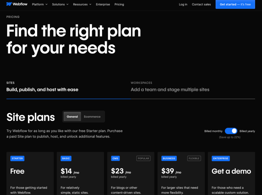
Take Webflow, for example. Their pricing page follows the textbook SaaS layout of generic headline, pricing table, and FAQs. It’s clean and gives you all the information you might need. But it’s not compelling.
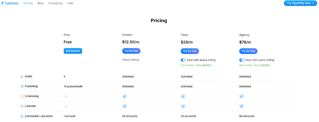
Typefully’s pricing page does the same. They open up with the one-word “pricing” page title *shudders*.
(If you’ve read Vesna’s blog on the conversion glow-up your SaaS pricing page is begging for, you’ll know why this one-word headline is a total SaaS pricing page no-go)
From here, they launch into a four-way comparison table and overwhelm you with reams of features. One thing they do that is nice is share real testimonials that users shared on X. But, that’s kind of the only thing they do to demonstrate impact.
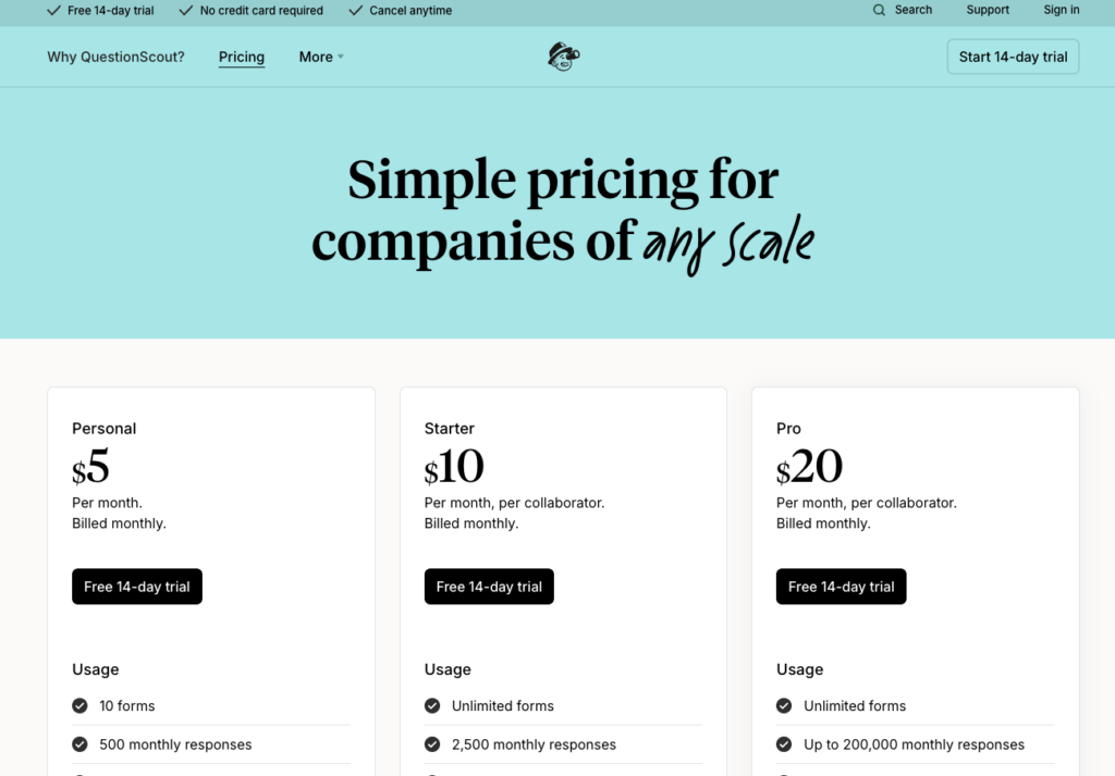
QuestionScout’s pricing page does it too. Everything’s in a neat, logical table followed by some FAQs. That’s it. No social proof. No qualifying statement to overcome hesitations. No emotional pull. Just pure logic.
All these pricing pages do the job. They quite literally tell you about the pricing. But they don’t inspire urgency. They don’t drum up emotion. They don’t encourage you to actually put your money on the table.
And that’s the problem.
The problem with logic-led pricing pages
Here’s the irony…
Your pricing page is the closest point to conversion. It’s the moment where your prospect is sat there, credit card in hand, thinking about hitting the “sign up” button.
Yet, a purely logical flow is one of the least convincing ways to get people to convert.
Why?
Because logic alone doesn’t move people.
Most SaaS pricing pages assume their visitors are already primed and ready to buy. They just need a quick checklist of prices, features, and logos, right?
Nope. That’s not true at all.
The reality is that you don’t know what stage of the journey your visitors are at.
Some land on your pricing page early, when they’re still researching. Some are just browsing, noodling around all the pages of your website. Some are curious but cautious.
And if all they find is a dry, logical factsheet? Their interest fades. Their excitement dips. And their doubts creep in.
A logical pricing page structure triggers what I like to call glazed-eye syndrome.
When we see rows of prices, bullet-pointed features, and samey FAQs, our brains switch off. Our emotions lie dormant. And our money stays in our pocket.
Nothing about a logical pricing page builds momentum or urgency. It’s like putting an egg, some flour, sugar, and vanilla in front of someone but forgetting to show them the delicious slice of cake they could enjoy. It doesn’t quite have the same “I want it” impact.
Simply put, if there’s no emotional hook, there’s no action.
That’s why you need to use your pricing page to create emotion.
Moving to an emotion-led pricing page
Pricing pages are often built on logic. But people aren’t always logical beings.
We laugh out loud at movies. Cry at adverts. Buy things on a whim because it makes us feel something.
We don’t just make decisions based on facts. We make them based on emotion.
So, it’s time to shake up the way you write your pricing page.
Don’t worry… You don’t need to throw the whole thing out. The traditional logical flow gives you a great foundation to build on.
You just need to layer in emotion to make sure your pricing page connects, reassures, and nudges people to act.
Here’s what an emotional pricing page does differently:
✓ It uses headlines to connect with your audience’s challenges and goals
Instead of “Choose your pricing plan,” think “Stop wasting 3 days a month creating reports from scratch”.
Dig into real customer data to pinpoint the exact challenges or goals your tool can solve for your audience. This will help you write a pricing page headline that actually strengthens the value of your tool while prioritising the desires of your audience.
✓ It convinces visitors to pick a tier instead of just comparing features
Show them the value they get by upgrading or use subtle psychological tricks like the “ugly jerry effect” to draw their interest to a specific tier.
Playing on people’s emotions can be as subtle as drawing their eyes to a particular tier or adding annotations like “most popular” to nudge them toward making a choice.
✓ It clearly communicates the benefits to them, rather than just showing vague features
Don’t just list “Unlimited users.” Say “Unlimited users for no extra cost.”
It’s a double-whammy of benefits. The unlimited users? That’s an incredible benefit. And they get it without paying extra? Even better! Layering benefits together amplifies the value of your tool.
✓ It gives proof that people just like them already love your tool
Swap cold company logos* for relatable testimonials.
Bonus points if it’s a real testimonial pulled through from X or screenshots of good things people actually said about your SaaS tool in the wild.
*Okay, don’t actually get rid of them altogether. Showcasing company logos is great. Just, don’t forget to also show real words from real people.
✓ It recognises and overcomes objections with empathy
Understand why someone might hesitate to convert. And speak to those fears before they even ask.
Add a content block to your SaaS pricing page that offers a solution to directly overcome the hesitations that are stopping someone from converting.
They aren’t sure what your tool can do? Offer them a free demo.
They’re worried about whether they’ll get good value for money? Give them a free trial.
They don’t know if your tool will help them achieve the result they’re looking for? Offer them a no-questions-asked guarantee.
Why emotion-led pricing pages work
If you want to drive more sign-ups, you can’t rely on logic alone.
Emotion is the real catalyst for action, and science backs it up.
A 2023 study found that emotional advertising increased impulsive and irrational buying behaviors. It also created an emotional connection that led to positive purchase decisions.
Another study by Motisa found that emotionally connected customers have a 306% higher lifetime value than those who aren’t emotionally engaged.
If you want users who stick around and become loyal advocates, you need to connect with them emotionally. And emotion-led pricing pages do just that.
Use an emotion-led pricing page to reflect your customers’ thoughts and feelings back at them.
When someone lands on your pricing page, they’re often carrying a mix of emotions — hope, frustration, anxiety, excitement…
You can use your pricing page copy to mirror their feelings. This shows them that you understand what they’re going through. And you can use it to strategically position your product as the solution to all their problems.
The easiest way to do this is to base your messaging on Voice of Customer (VoC) research. Carry out VoC research so you can weave in the exact frustrations, motivations, dreams, and desires of your target audience.
Side note: If you’re not yet doing VoC research. Start. It’s absolute gold for emotional copy that converts.
This emotion-led copy helps you move away from sweeping statements like “level up your workflows” and replace them with something like “put an end to feeling overwhelmed by endless admin” that reflects their own feelings and experiences back at them. All because you used their actual words and experiences, instead of defaulting to cliches, jargon, and buzzwords.
When customers feel heard, they feel closer to buying.
Emotion-led pricing pages also guide people through their decision.
You can take prospects on a quick, powerful emotional journey by using classic copywriting formulas like PASO (Problem, Agitation, Solution, Outcome) or the Before-After-Bridge.
Rather than reading features and having to figure out what that means for them, your visitors will instantly feel the gap between where they are right now and where they want to be, with your tool as the bridge.
That’s what makes emotion-led pricing pages work. They turn your SaaS pricing page into a conversion machine.
The benefits of weaving emotion into your SaaS pricing page
If it isn’t already abundantly clear, let’s get clear on this one thing… adding emotion to your pricing page isn’t about making it sound nice and fluffy. It’s about making it work better. For your audience and your business.
Here’s what happens when you weave real emotion into your pricing page:
People will engage more
When you speak to feelings, you immediately grab people’s attention. Emotionally-driven messaging is more relatable, more human, and more memorable.
When you use words that hook people’s attention, they’re more likely to stick around. They will read more of your messaging and actually absorb what you’re telling them… instead of just skimming through your simple pricing table and bouncing away.
Your visitors will find it easier to make a decision
Logic makes people think. Emotion makes them decide. An emotion-led pricing page will help your users connect the dots faster.
You can use the words on your pricing page to help them realise…
“This feels right.”
“This solves my problem.”
“This is EXACTLY what I’ve been looking for!”
Instead of overanalysing tiny feature differences, they’ll move towards a choice that feels good. And when decisions feel easier, conversions happen faster.
You’ll help those fence-sitters get over their hesitations
Every SaaS tool has them. The curious prospects who almost buy… but hesitate.
Emotion helps tip those fence-sitters over the edge. Include sections in your pricing page that speak to those fears and concerns about subscribing. Use those sections to paint a positive, emotion-driven outcome that removes any anxiety that’s holding them back from signing up.
A well-placed testimonial, a reassuring headline, or a powerful guarantee statement are all examples of emotional cues you can use to build confidence and reduce friction at the critical moment.
Your conversion rates will be higher
Engagement + easier decisions + fewer hesitations = more people hitting that “sign up” or “start my free trial” button.
We’ve seen it time and time again. The moment a brand switches to emotional messaging, it sees a positive impact on buying behavior. Like how a major bank saw a 70% increase in account use and a 40% growth in new accounts when they connected with their customers’ emotions.
If you’re tracking metrics like Customer Acquisition Cost (CAC) or Customer Lifetime Value (CLTV), you’ll be able to see exactly how that emotional lift impacts your bottom line.
And yes, it will still appeal to those logical decision makers, don’t worry
This isn’t about abandoning logic.
The best pricing pages balance emotional resonance with logical reassurance.
Emotional headlines and benefit-driven messaging pull people in. Meanwhile, logical familiarities like pricing tables, FAQs, and social proof bars help people rationalise the decision afterwards.
I’m not asking you to choose between logic and emotion. I’m asking you to combine them to meet your visitors wherever they are in their buying journey.
Remember this:
Emotion gets them to say “This is what I need” and logic helps them say “And here’s why it makes sense.”
How to create an emotionally charged pricing page
Okay, we’ve talked about why emotion matters. Now, let’s get into the how.
Here’s some ways you can infuse emotion into your pricing page without losing clarity or credibility.
Use psychological triggers in your copy
Resonating with people’s emotions means you’ve got to understand people on an emotional level.
You can use proven psychological triggers to spark people’s emotions and nudge them toward taking action.
Three psychological triggers you can start weaving into your SaaS pricing page today are social proof, loss aversion, and price anchoring.
Social proof
As much as we hate to admit it, as humans, we’re constantly looking to others to guide our behaviors and actions. This kind of conformity is known as social proof.
Social proof bars like user reviews, testimonials, or reputable user logos demonstrate that others like them are using your tool to generate the exact type of results they’re looking for.
I recommend adding a social proof bar close to the top of your SaaS pricing page. A row of user logos works well here. Bonus points if it’s paired with a big number to demonstrate the sheer volume of happy people using your tool or if it shows some well-known companies to increase trust through enhanced credibility.
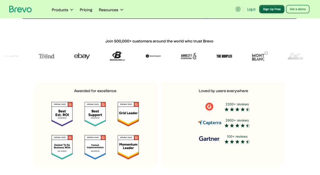
The email marketing and CRM platform, Brevo uses social proof well on their pricing page. They pair it with a big number, showcase some credible user logos, and add complementary content blocks to show user reviews and awards. This entire section of their pricing page does a great job of building trust and confidence that you’re making the right decision.
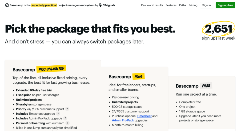
Basecamp does this with a twist by displaying a sign-up counter in the corner of the hero section that reads “2,651 sign ups last week”.
As mentioned earlier, adding real screenshots is an incredible way to demonstrate social proof. In fact, it’s probably my favourite way. A well-designed testimonial block might look the part. But a raw, real-life review is much more impactful.
Loss aversion
Loss aversion is a cognitive bias where the emotional impact of a loss is felt more strongly than the pleasure of an equivalent gain. This results in people being more motivated to avoid losses than achieve gains, even if the two are similar in magnitude.
Use loss aversion on your SaaS pricing page by framing the potential losses users can avoid by using your software or by highlighting the negative consequences of inaction.
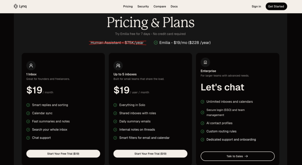
Lynq, an AI email assistant, uses loss aversion techniques on their pricing page by positioning the cost of a human assistant side-by-side with the cost of their tool. The direct comparison of $75K/year versus $228/year makes choosing their tool seem like an instant no-brainer.
Price anchoring
We can’t talk about a pricing page without mentioning price anchoring effort. It’s a classic cognitive bias where the first price someone sees ‘anchors’ their expectations for all subsequent prices.
There are several psychological techniques you can use when it comes to price anchoring.
Some SaaS companies make the tier they want people to choose stand out against the others to anchor people toward that price. It’s why we tend to see the preferred plan in the middle of a pricing table. They might even add a banner to really encourage people to choose that plan.
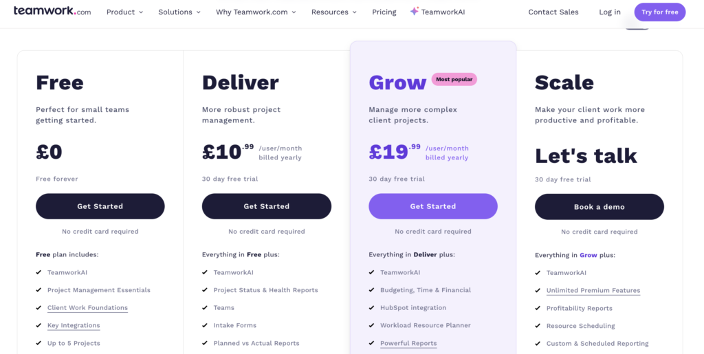
The project management tool, Teamwork, does exactly that. Their ‘Grow’ plan stands out visually, instantly drawing your eyes to it. This anchors the expected price at £19.99 and reinforces it as the preferred plan with a ‘Most popular’ banner.
Others will use ‘decoy pricing’ by presenting their preferred pricing plan against a less desirable option, such as one that’s significantly more expensive or one that’s much cheaper but comes with far fewer features.
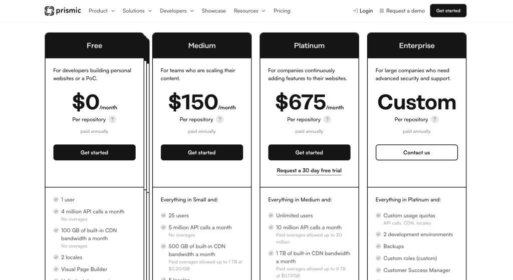
Take Prismic, for example. This headless page builder positions its $150/month plan next to a $675/month option. While some companies will be best suited to the $675 plan, this side-by-side positioning will strategically anchor $150 as a great value rate for most other prospective users.
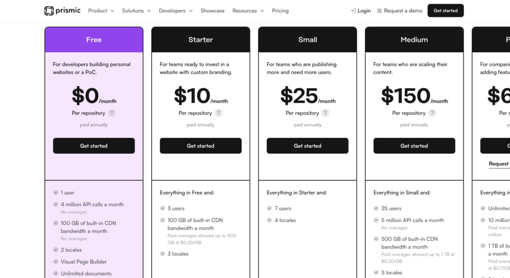
The Prismic pricing page also has a fun interactive feature. If you hover over the free plan, it will reveal a couple of hidden $10 and $25 monthly plans. This is another way they use price anchoring for their $150 monthly plan by making sure you don’t get distracted by those cheaper monthly plans at first glance.
Put your users’ words at the heart of your messaging
The best way to make sure your pricing page lands with the right people? Listen to what your current users are saying.
The best marketing copy speaks its customers’ language. It uses the exact words they use and replays the exact experiences they’ve been through.
Voice of customer research is one of the most powerful tools in your brand messaging toolkit. And if you’re involved in product marketing, copywriting, or UX, it’s likely you already know that.
Make sure the words on your pricing page speak directly to your target audience by talking to real users. Survey them. Interview them. Listen to what they have to say.
Read support tickets. Scan reviews. Look at community threads and forums.
Find the exact words they use to describe their problems, frustrations, goals, and wins. Dive into the past solutions they tried and the frustrations they felt. Dig into the outcomes and “a-ha moment” your tool delivers.
Then reflect those words and experiences right back at new, perfect-fit prospects on your pricing page.
Design for emotional impact
Any writer worth their salt knows that words alone won’t cut it.
You can have the best, research-backed, psychology-proven words in the world. But it means nothing if they’re presented on a drab, thoughtless design.
Design plays a huge role in shaping people’s emotions. Make sure the design of your pricing page reflects your brand personality and the emotion you want new users to feel.
Your design should be clear and trustworthy. Headlines should capture attention without feeling pushy (unless, of course, that’s the exact voice your audience responds to…)
Content blocks should be strategically placed to support users at each stage of their journey, gently taking them from initial awareness and consideration through to overcoming hesitations and reaffirming that this is the right decision.
Your most popular plan should be visually highlighted to guide people to choosing that plan – either subtly or overtly, depending on what your audience responds to best.
Other ways you can incorporate design for emotional impact include:
-
- Use whitespace to avoid overwhelm
-
- Create emotional cues through your colour choices
-
- Use eye-tracking techniques like F-shape pattern or layer-cake pattern (top tip: use heatmapping tools to gauge how people read your copy)
While we may be writers and not designers, it’s crucial we understand UX design fundamentals. We need to know the interplay between copy and design if we want our words to have an impact.
Speak to people’s desires (not discounts)
Enticing people with discounts can be tempting. Especially when you see that spike in sales on your monthly user chart. But discounts are often short-lived.
They capture the interest of price-sensitive customers. And while this can cause a temporary increase in users, those price-sensitive users are just as likely to churn when the discount period is over.
If you want to reduce churn, lean into desires. Not discounts.
Think about saving people from their frustrations and desires, rather than just saving money. Think about selling their desires, not just cost savings.
Sell the transformation. The freedom. The relief. Sell whatever it is your VOC data identified as being the primary motivation or underlying desires of your target customers. Then turn that into the emotional force that runs through your pricing page copy.
With all that said, I still think offering customers an annual discount is a great idea. It helps secure long-term revenue and, paired with strategic onboarding email workflows, can turn those customers into loyal, long-term users.
Examples of emotion-led pricing pages in the wild
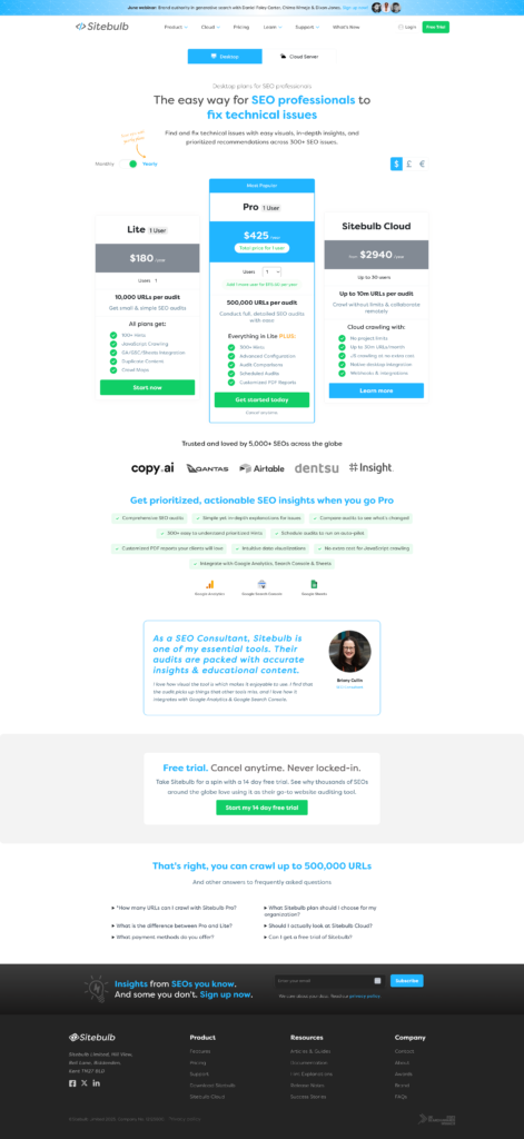
Sitebulb’s pricing page subtly layers emotional messaging into a logical structure beautifully.
(Full disclosure: I wrote their pricing page after deep voice-of-customer research!)
Instead of just listing pricing tiers, Sitebulb speaks to the key objections of potential users with real customer language. This pricing page flows from an emotion-led page title to a strategic pricing table, social proof components, and well-placed offers to overcome hesitations.
It’s a simple yet well-thought-out pricing page that leads with emotion (if I do say so myself.)
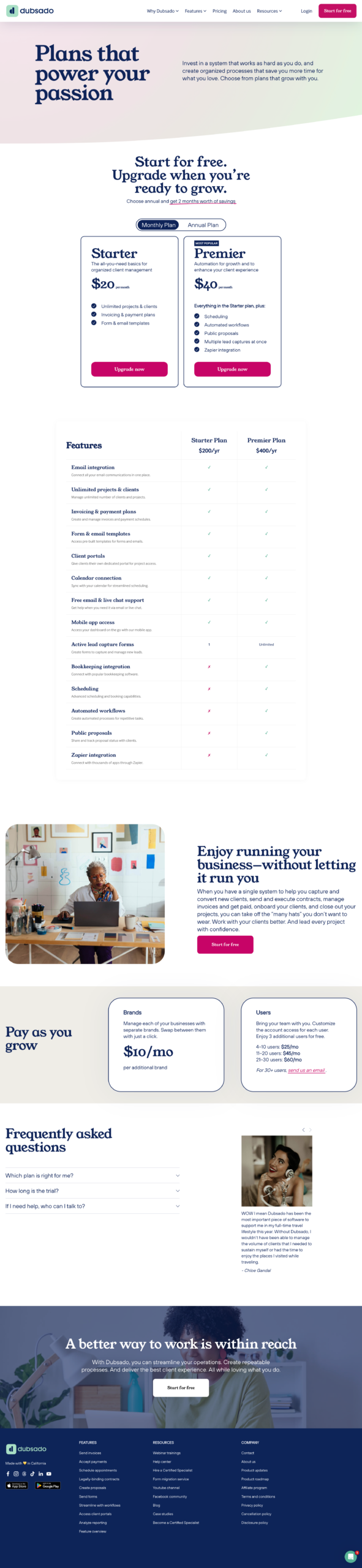
Dubsado uses emotional, empowering copy that speaks directly to the fears and hopes of freelancers and business owners. Throughout the entire pricing page, they focus on overcoming hesitations related to pricing and business growth.
As users scroll through the page, the design and copy gently empower them to take action. This approach makes the idea of signing up feel supportive and exciting, not stressful.

Coconut has a simple pricing structure. While they only have one set plan, their copy taps into emotional drivers with phrases like “spend a little, save a lot” and “less than a few lattes each month.” All their copy centres on financial hesitations or goals.
They back this up by offering a 30-day free trial, which is repeated at the top and bottom of the page. Plus, they share real user testimonials. Although, the auto-scroll effect is nauseating. I’d recommend stopping the auto-scroll if they want to deliver a punch of impact. Better yet, stack the testimonials or just pick 1–2 standout reviews to showcase.
Use these AI prompts to bring emotion into your pricing page copy (without sounding robotic)
AI works best when you nurture it. It’s unlikely you’ll input one standalone prompt and get a groundbreaking response. To get the most out of AI, guide it step-by-step just like you’d coach a new team member.
Try this series of AI prompts with ChatGPT (or your generative AI chatbot of preference) to weave more emotion into your pricing page.
AI prompt 1 — Setting the scene
This first AI prompt will set the scene for your interaction with ChatGPT. It gives the tool the initial information it needs to understand your SaaS tool and your target audience
Here’s what to enter as your first prompt:
I want you to act like a persuasive conversion copywriter who knows the power of understanding human behaviour and the impact emotion has on decision-making.
As a persuasive conversion copywriter, you will help me write copy that connects with my target audience and convinces them to sign up for our SaaS tool.
We are [brand name]. We offer [describe your SaaS tool.]
Our target audience is [describe your target audience -– get as granular as possible here.]
In the past, they’ve tried [highlight the other solutions your audience will try.]
We help them [outline the outcomes you provide for your target audience — get to the ultimate outcome.]
Don’t worry about what ChatGPT says in response to this. We’re just feeding it some initial information at this stage. AI works best when you take time to train it on your brand and audience.
Remember: The more information, expert guidance, and feedback you provide, the better the results you get from AI will be.
AI prompt 2 — Layer in Voice of Customer data
Next, tell ChatGPT about your customers. When doing this, focus on their motivations, emotions, desired outcomes, and favourite features.
Be clear in showing how your tool benefits your customers. For this section, I recommend conducting VoC data and speaking to actual customers to gather this information. Then, feed those insights into ChatGPT.
For this exercise, I’ll show you how to do it with public testimonials and reviews:
Now, I want to make sure you deeply understand the needs of our customers.
We spoke to our customers and we know the following about them:
Motivations: Our customers are motivated to [include list of motivations uncovered by your VOC research]
Emotions: Our customers feel [describe how your customers feels before/during/after using your tool]
Challenges: Our customers use our tool to overcome [describe the challenges they are trying to overcome with your tool]
Desired outcomes: Our customers use our tool because they want to [describe the outcomes your customers want to achieve]
Favourite features: Our customers particularly enjoy the following features [describe the favourite features and, if possible, state why]
I have also attached the raw customer data for you to read. Please use this data to better understand our customers’ experiences and their motivations, emotions, challenges, desired outcomes, and favourite features.
Then, synthesise these insights to provide me with the deeper motivations and emotions of our audience and identify the key copywriting opportunities where I can connect with these emotions to encourage action on our pricing page.
When you do this, ChatGPT will give you a more granular reflection of your audience’s current state. It will also identify copywriting opportunities that are mapped to these emotions and motivations. These insights will help you steer away from logic and move closer to emotion-led copy.
AI prompt 3 — Craft emotion-led headlines and value propositions
When people land on your pricing page, the headline is the first thing they’ll see. Use it to emphasise the value your tool provides.
Teach ChatGPT to give you emotion-led headlines with this prompt:
Thanks. Now, I want to make sure our Pricing Page headline is emotion-led. The headline should act as a value proposition that reinforces the value people gain (or the current challenge they eliminate) from using our tool.
Please write a series of potential Pricing Page headlines using the following copywriting frameworks:
– Use the before-after-bridge to position their current (undesirable) state against their future (desirable) state and use our tool as the bridge that connects the two.
– Use the Problem-Agitate-Solution-Outcome formula to address their current problem, agitate it, introduce our tool as the solution, and emphasise the final, most desirable (but still realistically achievable) outcome they can achieve.
ChatGPT will then present you with a series of potential headlines. Remember, you’re the writer here. What ChatGPT suggests may not be the perfect headline. But, it will serve as a great first draft for you to build on.
You can get even deeper with this prompt by providing ChatGPT with various headline structures and formulas to test. At this part of the AI prompting process, experiment. Have some back-and-forth discussion with the AI chatbot to create a series of headlines you’re happy with. Remember, AI is always best with a human touch and some expert oversight.
AI prompt 4 — Map pricing plans to emotions
The pricing plan comparison table is a key part of any SaaS pricing page. You can add some emotional touches to the table by understanding which type of audience member is best suited to each plan, and the emotional state they’re likely to be experiencing.
Use this prompt:
Thanks. Now, I want you to help me identify which specific type of customer is best suited to each tier in our plan options.
Then, help me write a short, emotion-led value proposition statement for each tier. This value proposition statement will help them quickly determine which tier is right for them based on their motivations, challenges and/or desires
These are the tiers we offer: [Provide the details of each tier including the price and features]
ChatGPT should then give you a brief overview of who each tier is best suited for, followed by a value proposition statement that provides an insight of your target audience’s state and how each tier specifically helps them. Again, you may need some back-and-forth prompt engineering to finetune this statement.
You could place the statement at the top of each tier so potential users can quickly skim-read and see which is best suited to them.
Here’s a follow-up prompt I use to encourage ChatGPT to produce refined value proposition statements:
Make the value proposition statements much shorter and snappier. It should be something people can very quickly skim-read to determine which tier is best suited to them.
Think along the lines of: Take control of [pain point] with [solution] / for when you’re [current state] and want [future desire] / Built for [audience type] who [current challenge or goal]
AI prompt 5 — Build confidence
As we’re looking to make your SaaS pricing page more emotional, use AI to develop some confidence-building statements that can be included on your pricing page.
These confidence-builders appear as reassuring microcopy next to call-to-action (CTA) buttons, as the CTA button itself to bake in more value, or as annotations or subheadings.
Use this AI prompt to develop this snappy statements of confidence:
Thanks. On our pricing page, we want to add some confidence-building statements that help our target audience recognise we’re a brand they can trust.
These should emphasise the ways we help reduce friction, ease their challenges, and help them achieve their desired outcomes. They will make it easier for people to make the decision to buy our tool, setting their minds and ease and/or making them feel excited.
These should be extremely short statements.
AI prompt 6 — Overcome hesitations
Some people will have hesitations before purchasing. For those people, including a section that eases worries and overcomes objections can be the thing that gets them over the purchase line.
Try this AI prompt to develop a section that overcomes hesitations to purchase:
Thanks. As the pricing page is when people are most likely to be closest to purchase, we really want to make sure we do everything we can to ease any objections they may have.
Please write copy for a short, persuasive section on the pricing page that helps potential subscribers overcome this hesitation that’s getting in the way of their decision to purchase.
For context, we have identified the key hesitation to purchase as being [describe the hesitation that people most likely experience]
You can also offer people something to help them overcome their hesitation. If you do this, make sure you prompt ChatGPT on what this offer is so that it can include it in the section. Add the following line to your prompt to capture this:
To help potential new users overcome their hesitations to purchase, we offer [describe the offer or guarantee you provide to overcome objections]. Please make this a key focus for this section.
AI prompt 7 — Get recommendations for your current pricing page
Finally, plug your current pricing page into the AI chatbot conversation to identify some targeted ways you can increase emotion to drive conversions.
Use the following prompt to do this:
Now, please review our current pricing page then advise on ways we can add more emotion-led conversion copywriting to increase sign-ups:
[URL for your pricing page]
This should give you an emotion-led audit of your existing pricing page, helping you quickly identify areas for improvement.
Better yet, use my Audience Voice Architect Custom GPT to get ChatGPT to turn your existing customer data in high-impact messaging angles for your pricing page.
Remember: Swap logic for emotion if you want to drive more SaaS subscriptions
Most pricing pages play it safe with a logical structure. But being safe doesn’t sell.
Your words have the power to build trust, drum up excitement, and drive action. Use them. Tune into real emotions, objections, and outcomes. Then turn those experiences into punchy pricing page copy that shows people why your product is the right choice for them.
When your pricing page connects with people on an emotional level, it sticks with them.
Want me to audit your pricing page? Book a conversion copy audit here.
Or just want me to rewrite your pricing page so it drives more conversions? Drop me a line to get the ball rolling :).