Uncategorised

  • Good UX isn’t about saying “we told you”: Why clear content is crucial for creating a good user experience

    I recently spent £300 to be sent on a wild goose chase.

    Or at least, that’s what it felt like.

    I ordered a £300 Medication Check test from Bupa, hoping to get some results ahead of my upcoming neurology appointment.

    Except, one easily missed instruction meant my DNA sample couldn’t be processed and I had to start the whole process again (and I’d no longer have the results in time for my appointment).

    Technically, the information I needed was there. But simply putting the right information in front of someone doesn’t automatically make it a good user experience.

    Because good UX isn’t just about what you tell people. It’s about understanding what they’re trying to do, what they need at that moment, and making it as easy as possible for them to do it.

    And my recent experience with Bupa is a pretty good example of why clear content matters.

    Is it user error or a poor user experience?

    I’d ordered a Medication Check test from Bupa. The kit arrived, I took my DNA sample, packaged everything up, and sent it back.

    Two weeks later, I received an email telling me the lab couldn’t process my sample.

    Why?

    I hadn’t included the returns form.

    So, I dug out the paperwork I’d kept and looked again. And sure enough, the instruction was there.
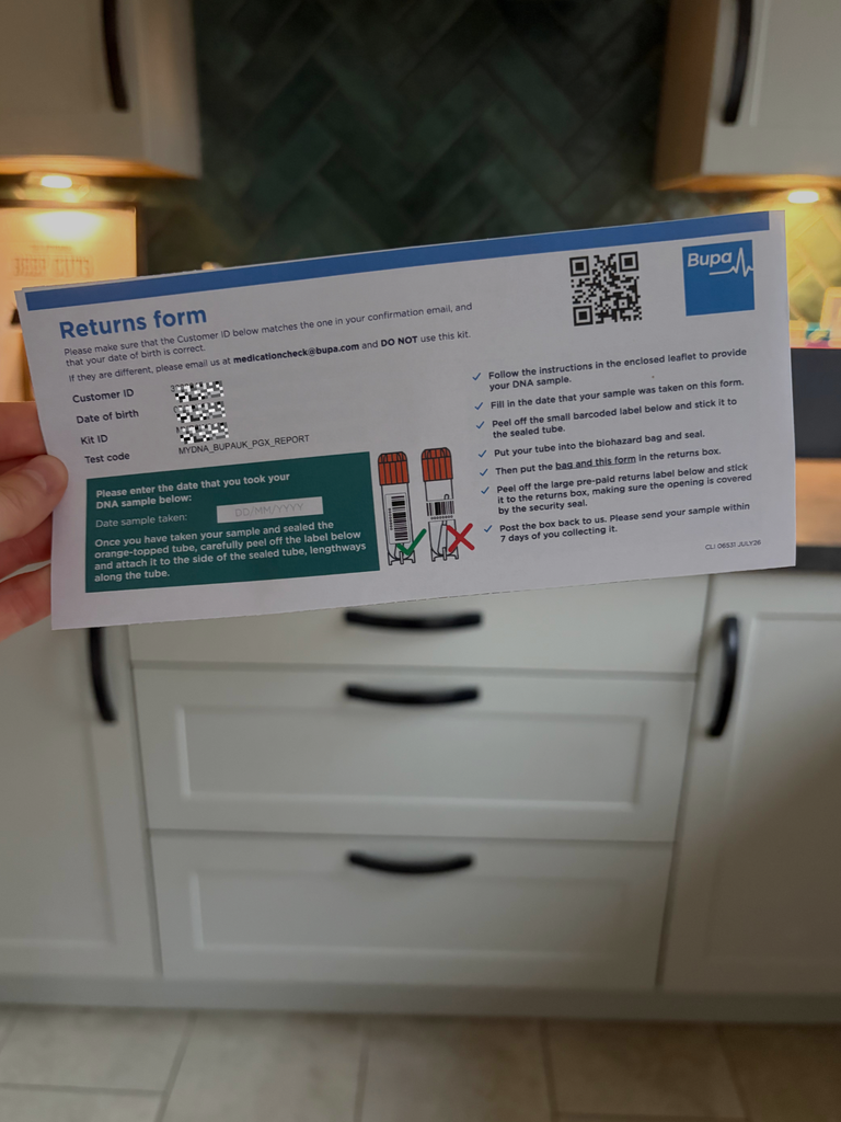
    Squeezed into a tiny A6-sized box containing seven different instructions, bullet point five said:
    “Then put the bag and this form in the returns box.”

    That was it.

    There was nothing to say this particular instruction was critical. Nothing warning me that if I missed it, my sample couldn’t be processed. Nothing telling me I’d have to start the whole process again.

    But the information was there.

    And yes, you could stop me right here and say, “Well, that’s just user error. You didn’t follow the instructions” and do you know what? You’d be right.

    It was user error. I did fail to follow the instructions.

    But the reason I failed is because the user experience was so confusing.

    Good UX isn’t about being able to say “we told you”

    Now, Bupa could have just said “well, we did tell you”. After all, they did put that information on the paperwork.

    But, even though the information was there, it still resulted in a broken user journey.

    That small bullet point typed in a size 8 font was too easy to miss. But in order to understand why it was so easy to miss, you need to look at everything else I was doing at the time.

    The user journey can be longer, more nuanced, and more fiddly than you think

    Here’s what my user journey looked like from the moment I received my kit:

    1. Open the box
    2. Try to find the instruction leaflet
    3. Read through the leaflet
    4. Read through the leaflet a second time while grabbing all the components I need to do my test
    5. Read through the leaflet a third time while following the steps (which includes ripping open the swab, swabbing my cheek, counting while swabbing, opening the sample tube, popping the swab inside, snapping the swab, closing the sample lid, disposing of the leftover swab handle)
    6. Then I had to find a barcode sticker and follow instructions to put that sticker on the sample tube, ensuring I did it the right way round
    7. Put the sample tube in a biohazard bag and seal it
    8. Put the sample back inside the box
    9. Read the instructions again and see it just says “Post it back to us”
    10. Spend a few minutes looking over the paperwork to see if they say how to send it back (they don’t)
    11. Notice it’s a Royal Mail returns label so assume I can just take it to my local returns locker
    12. Follow the instructions to stick the returns label on the box

    That’s a lot of tiny tasks all adding to my cognitive load.

    With all that faffing, my eyes had completely skipped over the line that said “Then put the bag and this form in the returns box”. And, being completely honest, I also missed another instruction on the other side of the paperwork that told me to write the date of my sample.

    But this is the exact type of situation where good user experience really matters.

    When you ask someone to do something, you need to think about what else is going on for them in that very same moment. In this case, my task at hand was to complete a DNA sample and send it back.

    While doing that, I’m scanning all the information, looking for the most important steps, interpreting what I need to do, and doing it.

    There was nothing to tell my brain:

    “HEY. THIS BIT IS IMPORTANT. IF YOU DON’T DO THIS. NONE OF THE OTHER STUFF YOU DID MATTERS”.

    This is why I write copy through a user-led lens

    The user experience is something I’m thinking about all the time when I’m writing copy and content for businesses. I’m not just thinking:

    What do we need to tell people?

    I’m also thinking:

    What does this person need from us at this exact point in the journey?

    What are they trying to accomplish? What do they expect to happen next? What information matters most right now? What might confuse them? What do they need to feel confident taking the next step? What happens if they misunderstand something?

    And, the big one: How can I make this easy for them?

    Approaching your business copy and content through that user-led lens completely changes the way you write.

    It’s also why I’m big on bringing copy and design together

    Whenever I’m writing website copy, I always create lo-fi wireframes in Figma. And even when I’m writing ad copy or writing for brochures, you’ll likely catch me sketching things out on paper to see what it might look like.

    Why? Because your content doesn’t exist independently from the experience around it.

    A CTA button goes hand-in-hand with all the information someone wants to receive before they feel comfortable clicking it. A form has to be paired with clear instructions for how to fill it out. A landing page needs to reflect the ad, search result, or email that sent somebody there.

    And if your content isn’t easy to follow or your design is too distracting, your users are likely to run into problems.

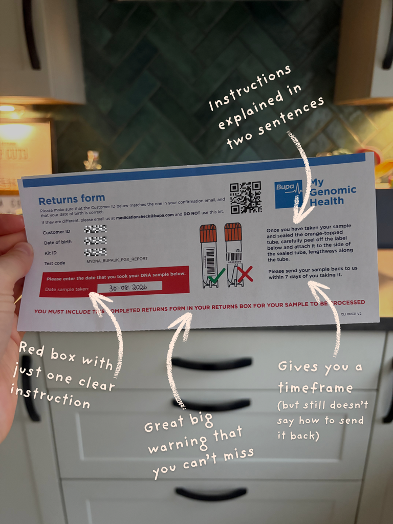
    If we look back at the Bupa form, we can see that on one side there’s a list of wordy instructions. In the middle, there’s an image showing how to apply the label to the tube. And, on the other side, there’s a bunch of ID information and a box featuring an entry field where I can write a date, followed by instructions underneath it about the label.

    Not pictured is the other piece of A4 paper detailing the instructions for taking my sample. So, at the same time as completing the sample, my eyes are also darting here, there, and everywhere between these two pieces of paper to figure out what I need to do.

    It’s why writing with a user-led approach needs you to consider the full user experience across both copy and design.

    Sometimes, you might need to add more information. Sometimes, you need to say less. Sometimes, you have to re-order things. Sometimes, you have to turn three paragraphs into three bullet points.

    Other times, you have to make a box blue so the copy stands out, put something in bold text, or putting a sentence in whopping great big letters because that is the one sentence you absolutely cannot afford for somebody to miss.

    Which brings me back to Bupa…

    If something is critical, it needs to look and sound critical

    After I received the email telling me my sample couldn’t be processed, I contacted Bupa.

    Their customer support team were brilliant.

    I explained what had happened and also fed back on the experience. I pointed out that the requirement to return the form was incredibly easy to miss and suggested that something as simple as a clear banner saying “You must include this form with your sample” would make the importance much clearer.

    What can I say, it’s hard for me to turn off my work brain sometimes…

    The team was brilliant. They swiftly sent out a new kit and assured me they’d try to fast track my new sample.

    And when my new kit arrived, I got a surprise.

    The returns form was completely different.

    It turns out, I must have received an older version of the form with my original test.

    The newer version addressed almost every problem I’d noticed.

    Instead of seven instructions crammed together in tiny text, the instructions had been drastically simplified.

    Instead of putting another instruction inside the box where I needed to write the date, the new design gave the date one clear job.

    And running across the bottom in big, bold, red text was a warning:

    “YOU MUST INCLUDE THIS COMPLETED RETURNS FORM IN YOUR RETURNS BOX FOR YOUR SAMPLE TO BE PROCESSED.”

    In other words:

    The critical information finally looked critical.
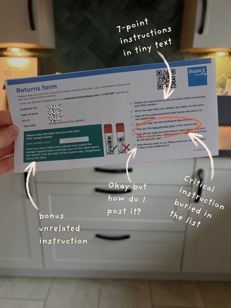
    The difference between the two forms is pretty striking. The first buries the returns form requirement among seven instructions. The revised version strips back the competing information and gives that requirement its own prominent warning.

    Now, I want to very quickly make something clear here…

    I don’t think Bupa saw my email, held an emergency UX meeting, and redesigned the form overnight. I’d obviously just received an older version the first time around.

    But it meant that I accidentally got to hold a real-life before and after of UX improvement.

    The problems I’d experienced as a user had already been recognised somewhere within the business, and the new version showed how relatively small changes to content, hierarchy and design could make the process significantly easier to follow.

    Good UX is something you keep working on

    This isn’t a Bupa teardown. Far from it, in fact.

    Bupa did an incredible job at reviewing their own form and improving it. I just had the joy of getting to accidentally experience it from the perspective of a user.

    Bupa has its own UX team and clearly cares a lot about creating user experiences that work. Back in 2022, Becky Colley shared openly online about her experience as a Lead Product Designer (UX) at Bupa and establishing a UX community of practice there. In this detailed process, you can see exactly how she helped fine tune the way they approach UX and make organisation-wide improvements by encouraging the team to share work, critique one another’s designs, run retrospectives, and continually learn from what was and wasn’t working.

    That’s important because UX isn’t something you “do” once.

    Writing and designing something is the first step.

    You then have to watch what happens, listen to users, see how they engage with it, identify points of friction, test ways to improve it, and do it all again.

    The fact that I ended up with two different versions of the same form is a neat little demonstration of that process in action.

    The second version still isn’t perfect. For example, it tells you to return your sample within seven days but still doesn’t make particularly clear how you’re supposed to return it. But it’s a substantially clearer experience than the one I encountered first and that’s a huge step in the right direction.

    In healthcare, confusing content can have bigger consequences

    There’s another reason why this example interests me.

    This wasn’t an ecommerce return where a confusing instruction meant my jumper took an extra week to refund.

    It was healthcare.

    My original sample couldn’t be processed, so I had to repeat the test.

    Results can take several weeks.

    And because of that delay, I won’t have the information in time for the appointment I’d originally hoped to use it for. The appointment that’s taken my over eleven years to secure.

    Suddenly, a tiny piece of unclear content has a much bigger consequence.

    That’s why I think the bar for user experience needs to be particularly high in sectors such as healthcare and financial services. There’s so much more on the line.

    In SEO, Google uses the term YMYL (Your Money or Your Life) for topics that could significantly affect people’s health, financial stability, safety or wider wellbeing. Google says its systems give greater weight to signals associated with strong E-E-A-T for these topics because of the potential consequences of poor-quality information.

    Although YMYL is primarily an SEO and search quality concept, it’s one that I think holds a lot of weight when you’re thinking about content design.

    The higher the consequences of somebody misunderstanding your content, the greater your responsibility to make that content clear.

    Healthcare users, for example, aren’t necessarily interacting with your content under ideal conditions. They might be ill, stressed, tired, in pain, worried about a diagnosis, experiencing serious medical burnout… And then they’ve got the job of trying to complete a fiddly DNA test while wondering why on earth nobody has told them where they’re supposed to post the bloody thing.

    The NHS’s own service design guidance reflects this. It says healthcare teams should understand users’ clinical, practical and emotional needs, consider their entire experience rather than one isolated part of a service, and make services simple enough that people can succeed first time.
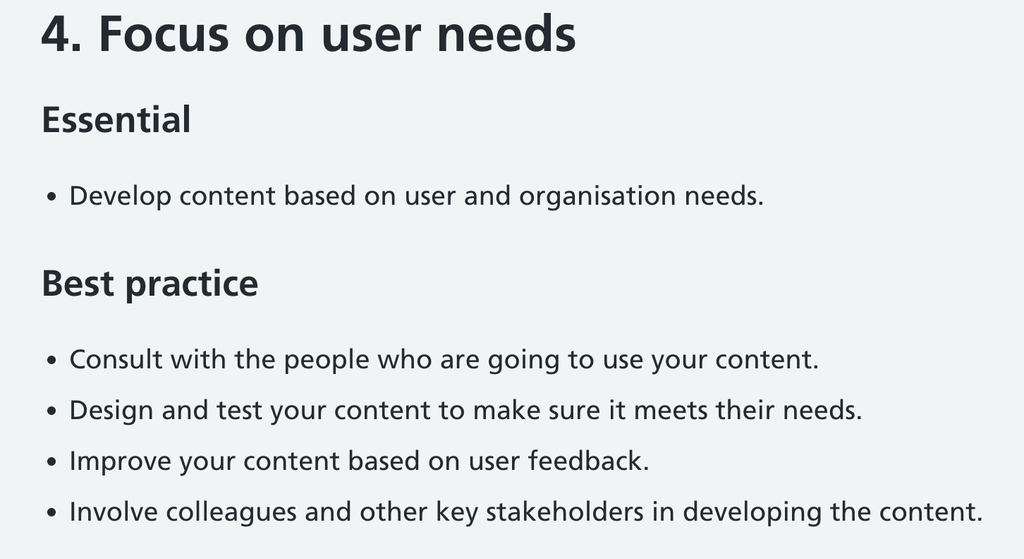
    Its health content standard also explicitly says content should be based on user needs, tested with users, simple and clear, and improved based on feedback. They also state you should make your content easy to use, advising that you “make sure your content and design are simple and clear”.

    This isn’t fluffy “make it user friendly” stuff. In healthcare, clarity and accessibility can affect whether someone successful accesses a service they need.

    Accessible content is more than ticking an accessibility box

    This is also where UX starts to cross over into something I think businesses need to consider more broadly, which is socially conscious service design.

    Things like adding alt text, meeting colour-contrast ratios, or passing a WCAG audit are important for accessibility. But accessible service design also needs to consider the reality of the people using the service.

    It has to take into account whether someone can understand what you’re asking them to do and if they’re able to complete the process. And if they can’t, what happens then?

    When writing and designing content, you need to ask yourself whether you have created this content with your actual users in mind. Because, frankly, there’s no point creating content for an imaginary perfectly attentive user when that doesn’t reflect the reality of your real-life users.

    The NHS makes a similar distinction in its guidance, recommending that services account for physical, mental-health, social, cultural and learning needs and design for low digital and health literacy. It even points out that using simple language helps people who are sick or stressed, not only people with recognised access needs.

    And its content accessibility guidance makes a wonderfully simple point:

    Clear content helps everyone.

    Good content improves the user experience

    My little DNA-test wild goose chase reinforced my belief that good content isn’t just about finding the right words. It’s about understanding what those words actually need to do to improve someone’s experience.

    Whenever I’m writing copy or content, I want to know where someone has come from, what they’re trying to achieve, what they need from us right now and what needs to happen next.

    Because technically correct content can still fail and a tiny sentence buried amongst six other instructions can completely derail the entire journey.

    Sometimes, you need to change a heading. Or maybe you need to remove half the words. Or, perhaps, you just need to put one sentence in huge red letters to explain YOU REALLY, REALLY NEED TO DO THIS BIT.

    Because good UX is about designing an experience that actually lets your users succeed.

  • How to turn a complex B2B offer into clear website messaging

    You know your offer is great. Your team knows it’s great. Your existing customers probably know it’s great too.

    But what about new prospects? What happens when they land on your website? Can they see just how great your offer is?

    If prospects land on your website and immediately find themselves wading through a sea of technical terminology, sprawling service descriptions, and sentences that make their eyes glaze over, there’s a good chance they aren’t able to see the value of what you do.

    Complex B2B businesses often struggle to clearly explain what they do.

    And it’s not because they don’t understand their service or product offering. In fact, it’s usually the opposite. They know it so deeply that they wind up overcomplicating it for their prospects.

    Here’s how to take your complicated B2B business offering and make sure it’s value is communicated clearly on your website (without dumbing it down or stripping away everything that makes it valuable).

    First, I want you to know that clear messaging isn’t the same as a simple offer

    Your business might genuinely be complicated.

    Perhaps you offer several interconnected services, your business has acquired multiple other businesses to create one mega-business, or your solutions needs to speak to different industries and teams. Or maybe the work itself is highly specialised, technical, or regulated.

    The complexity of your business isn’t necessarily a problem.

    The problem comes when you make your audience process it all at once.

    Your website needs to be able to communicate your business offering in words your audience understands.

    You can have the most complicated business in the world but I bet there’s a clear message behind what you do, who you do it for, and why they should choose you.

    Start by simplifying your messaging (and I mean the whole message)

    What usually happens when businesses try to clarify their messaging is that they will edit individual sentences. They shorten a paragraph here, replace a bit of jargon there, chop a few words out of the homepage headline, or run it through AI and ask it to “make this snappier”.

    That can help. But complicated messaging is rarely a sentence-level problem. The bigger problem is usually that the business is trying to communicate too much at once. They haven’t decided what to prioritise.

    When every feature, service, audience, benefit, and brand claim is given equal weight, your prospects has to work out the hierarchy for themselves.

    Most won’t.

    Your website copy should make your prospects lives easier not harder. So, make sure your copy isn’t unnecessarily complicating things for your target audience.

    Before you start polishing your website copy, get clear on the core message behind each of these questions:

    • Who is this for?
    • What problem are they trying to solve?
    • What outcomes do we help them achieve?
    • What should they choose us over anyone else?
    • What evidence makes those claims believable?

    You should be able to answer those questions for each page on your website. And if you can’t, a short, snappy headline won’t save you.

    As for how you get the answers to those questions, you need voice of customer (VoC) data. I’m talking about customer surveys, interviews, testimonials, case studies, customer support tickets, sales call transcripts, social media mentions, forum discussions…. soooo much data.

    It’s the only way to truly get to the real answer behind those questions. And, luckily for you, it’s the exact type of work I love doing. So, if it’s been a while since you last dug into your audience data, get in touch to see how I can help with VoC data analysis and messaging development.

    How to decide what to focus on when you’re simplifying your messaging

    Simplifying your messaging isn’t about squeezing your entire offer into the fewest possible words.

    You need to decide what your audience wants and needs to know. For example, your tech company might use an impressive combination of platforms, integrations, and proprietary processes. But your buyer’s first concern might be whether you can reduce reporting delays or bring fragmented data together. If that’s the thing they care about most, that’s the message you should lead with.

    Once you’ve shown you understand their wants and needs, you can then start explaining how you help and talking about your unique approach.

    A useful rule is:

    Start with the customer’s problems and desired outcomes. Then introduce your business offerings as evidence that you can solve it.

    That approach lets you simplify the way to speak about your complex offering by picturing it through the eyes of your audience.

    By doing that, you’ll change your messaging from “we deliver innovate, end-to-end digitral transformation solutions through a suite of integrated technologoies and proprietary processes” to a much easier to digest message of “replace disconneted systems and manual processes with one joined-up way of working with data”.

    The second version doesn’t explain the whole offer. It just gives the prospect a clear reason to keep reading.

    The problem with trying to say everything everywhere

    Another common problem I see technical B2B businesses make is this: They make the same broad claim everywhere.

    Their homepage, service pages, campaign pages, and About page all make the claims about how their experienced, innovative, customer-focused, and tailored.

    There’s a time and a place to introduce those messages. But you don’t need to do it on every single page.

    Clear website reveal information gradually, and only when it matters. The homepage established relevance and creates direction, encouraging people to navigate deeper through your website. Service pages explain specific problems, outcomes, and approaches while positioning your service as the solution. Case studies provide evidence. About pages strengthen trust. Supporting content answers deeper questions and build authority.

    Rather than trying to make every single page carry your entire business sales pitch, focus on making each page do its own job well.

    And if you’re planning to talk about how “innovative” your product is or how it’s “tailored” to your customer, make sure you’re backing it up with real evidence too.

    Do Voice of Customer research and use your target audience’s actual words

    One of the quickest ways to make B2B messaging harder to understand is to write it entirely from inside the business.

    Internal teams naturally talk in the language of capabilities, delivery models, product categories, and organisational structure. You’ve got your own jargon and ways of speaking about things.

    Your customers, however, tend to talk about what’s gone wrong, what they need to change, what they’re trying to achieve, and what they’re worried might happen next.

    Compared to your target audience, you’re simply too close to your product. You know it so damn well… and that’s kind of your downfall.

    The way your customers talk is a lot more emotionally charged… even when they’re being entirely practical. It’s part of being human. We’re emotional beings. So, your messaging should reflect those human emotions that exist within the scenarios related to your product or service.

    Your company might describe its offer as a “scalable, cloud-based business intelligence ecosystem”.

    Meanwhile, your customer is simply thinking “We’ve got data in six different systems and nobody can trust the reports”. They’re frustrated. They’re tired. There’s emotional weight behind the practical problem.

    Both descriptions could refer to the same problem. Your “scalable, cloud-based business intelligence ecosystem” just might be the thing they need to solve that issue of fragmented data and untrustworthy reports. But only one of those descriptions sounds immediately familiar to the person experiencing it.

    So, before you start talking about your “scalable solution” you need to first talk about your customer’s pain-points, needs, motivations, and experiences in the real, human, emotive words that make them feel seen and heard.

    Write your website copy from a user-led perspective and you’ll see how much it impacts engagement and conversions.

    Where to find Voice of Customer insights

    You don’t need to launch a six-month research programme before writing your website copy.

    It’s likely you’ve already got tons of valuable VOC insights inside your business ready for you to dive into.

    You can use:

    • Sales call recordings and notes
    • Customer surveys and interviews
    • Enquiry forms
    • Onboarding conversations
    • Testimonials and case studies
    • Support tickets
    • Reviews
    • Search queries and on-site search data
    • Conversations with customer-facing teams
    • Social media and forum discussions from your target customers

    When analysing VOC data, you want to look for repeated language around the situation that prompted them to look for help, the problems they’re experiencing, the impact it had, what they’ve tried, what makes them hesitant to take action, what they hope to achieve, and what they look for in a supplier… amongst other things.

    When I’m conducting VOC research, I codify insights against a number of behavioural motivations. I then use this to create a clear picture of your users’ needs and develop a user-led messaging strategy that’s backed up by real data.

    Write in your customers’ words without blindly copying them

    Voice of customer research doesn’t mean you just paste a transcript onto your homepage. But it gives you the bones for what your messaging should sound like if you want it to connect with the right people.

    Identify the patterns in VOC data and preserve the language that your customers genuinely use. Then, bring that to life through your website and use it to translate your expertise into something that aligns with what they’re actually experiencing.

    Good B2B messaging creates a bridge between what your customers already understand and what they need to learn from you. They aren’t necessarily thinking “I need this particular solution”. Instead, they’re thinking more in terms of “I want to solve this problem/achieve this goal” so your messaging should reflect those needs, not just speak in features and benefits.

    Speaking your customers’ language makes it a heck of a lot easier for them to see how you can help.

    Understand what your audience needs from each page

    One reason B2B websites become bloated is because you try to communicate everything, everywhere, all the time.

    But your website doesn’t need to explain everything in the hero section. It just needs to help someone understand enough to scroll down to the next section.

    When writing clear website messaging, I live by the rule of one. This essentially means that your company website should focus on one thing at a time: One offer, one audience, one action.

    On your homepage, you want to find the common thread that connects all your offerings and all your target audiences. That then becomes the one message for your homepage.

    So, instead of trying to sell 18 different services to 5 different audiences you find the one clear message that connects them all.

    Find the clear message you need to communicate in each section, and on each page, of your website. Then connect them all together to create a joined-up journey that encourages people to keep moving forward.

    Then, your service pages should each focus on one clear thing. Ideally, it should focus on one service, be written for one audience, and clearly communicate what one problem it solves and what one goal it helps them achieve. And it should have one clear call-to-action.

    Then, you can pepper in the supporting elements like proof points, benefits, and lower-ticket conversion actions.

    Before writing any page, ask:

    • Who is mostly likely to visit this page?
    • What problem might they be experiencing that we can help we?
    • What goal are they trying to achieve?
    • What one service or product can we present as the solution?
    • What information do they need to feel confident moving forward?
    • What questions are they trying to answer?
    • What do we want them to do next?

    The answers to those questions will help shape what the page says and clarify what action you want visitors to take after landing on the page. It should also help prevent you from getting distracted by other information that’s not relevant.

    Different pages need to answer different questions

    Every page on your website has a job to do.

    Your homepage helps visitors understand:

    • If they’re in the right place
    • the broad problem you solve
    • the main ways you help
    • why your business is credible
    • where to go next

    On service pages, your website visitors likely need:

    • more detailed explanation of the problem
    • the business impact of solving it
    • the solution you can offer them
    • how your approach works
    • evidence that you can deliver
    • a sensible next step

    As for people visiting your case studies, they might be wondering:

    • have you solved a problem like ours before?
    • do you understand businesses like ours?
    • what did you actually do?
    • what changed as a result?

    And people landing on your blog articles are likely looking for information to help them solve problems, understand things better, and evaluate their options.

    Page intent is important so make sure you map out where each page on your website sits within the wider user journey. Some pages, like blogs, will sit at the awareness stage, case studies and comparison guides can help at the consideration stage, and service pages and sales page are more valuable at the conversion stage.

    Every page should offer a meaningful next step

    The action you want someone to take won’t always automatically be “contact us”.

    That might be appropriate for a high-intent service page. But someone reading an informative article might be better off being directed towards a related guide, a case study, an on-demand webinar, service overview, or diagnostic offer.

    Consider what next step your audience might expect to take after visiting each page on your website, then create a user journey that aligns with those expectations.

    It’s also worth noting that not every page visitor will be ready to convert straight away so you should also consider building in lower-effort conversions actions. That might mean asking them to:

    • explore a relevant service
    • read a customer story
    • compare possible approaches
    • download a useful resources
    • book an audit or consultation
    • start a conversation with your team

    Clear messaging doesn’t just help people understand the page. It helps them understand what step to take next… and B2B website messaging done well makes it easy for them to take that next step.

    Finally, connect the full user journey

    People rarely experience your website in the neat order shown in your navigation.

    What’s more realistic is something like this:

    They land on an old blog post through Google → They read another blog post that’s linked from the first one → They click on your About page → They close your website and disappear from three weeks → Then, they stumble across your LinkedIn → They click to read a case study on your webiste → They open a service page → They leave your website again → They come back a month later and read your service page again → They download a free playbook → They get added to your email marketing list → Months go by of them occasionally reading your emails → They click a link in the email to visit your website → They go to a sales page → They fill out the enquiry form

    The user journey isn’t a smooth, straight line. It’s squiggly and messy with more loops than a white knuckle rollercoaster. But, every time they engage with your company’s website or marketing activity, they gain another piece of the story.

    If each of those pieces of your marketing strategy don’t connect, the journey will breakdown.

    When writing your website copy, you need to assess how each individual page fits into that wider journey. The message needs to be consistent between each page and with your other marketing channels.

    If every page is created separate from the wider journey you end up with messaging that changes from page-to-page, value proposition that shifts depending on what people are engaging with. One page might make bold promise that another completely contradicts. High-traffic articles will lead to dead ends. And useful proof will sit three clicks away from the service it validates.

    Even the strongest page will underperform if it isn’t connected to the wider user journey that it sits within.

    Give every page a job

    Think of your website as a interconnected journey rather than a collection of standalone pages.

    The best way to do this is to physically draw it out and then draw lines between your pages to see how they connect. You’ll soon see where connections are missing.

    Before drawing the connections between the pages on your website, each page should do at least one of these things:

    • attract the right people
    • help them identify their problem
    • present a possible solution
    • demonstrate your expertise
    • answer a question or objection
    • build trust through evidence and expertise
    • help them compare their options
    • move them towards a commercial conversion

    You also need to get clear on the intent behind the page. Does it exist purely for educational reasons, is it there to help people weigh up their options, or is it designed to get them to convert? This page intent can then by mapped to various stages of the marketing funnel, be it awareness, consideration, conversion, or to uphold post-conversion phases of loyalty and advocacy.

    Once you know the role and intent of a page, you’ll find it easier to identify what should come before or after it.

    If someone lands on an educational article, which service pages or case studies should it link to? If they’re exploring a service, where can they see proof? If a case study builds confidence, does it also offer a clear route to the related service and how to get in touch?

    Internal links and calls to action aren’t just SEO or design details. They help turn scattered content into a coherent journey for your audience.

    Keep the core message consistent while adding deeper detail

    Connected doesn’t mean repetitive… and that’s where many B2B businesses go wrong when trying to make their messaging consistent. They end up making each page say the same thing so visitors wind up not being able to tell the difference between your different service offerings and why they should choose one over the other. Worse, they end up not being able to tell your business apart from your competitors because you all sound the exact same.

    Your central positioning should stay consistent across the website. But, and this is the important part, each page should add deeper detail that’s unique to the focus of that page.

    Think of it as progressive clarity that reinforces your brand positioning and deepens your value:

    • the homepage gives visitors the big picture of what your business does
    • service pages explain how that specific service solves a particular problem
    • Case studies prove you can do it
    • Articles help buyers understand the problem, approach, and options
    • Sales pages make it easy for people to take action
    • Industry pages make that relevance specific to that sub-audience’s unique needs

    Rather than repeating the same message across each page, see where you can add deeper value.

    Clear B2B website messaging is just complexity that’s well organised

    Complicated B2B offers often become confusing online because the website mirrors the business from the inside out.

    Clear messaging lets your target audience see the best parts of your complex offering. Clear messaging done right starts with knowing what your customers need, prioritises the most important message, and uses words they recognise. It gives every page purpose and connects those pages into a journey that builds trust, authority, and conversions.

    If your website contains all the right information about your business but isn’t connecting with your target audience or driving conversions, my Conversion Copy Audit can help you identify exactly where the message has become unclear… and what you need to change.

    You’ll get a focused review of three key pages, practical recommendations, sample rewritten copy, and a walkthrough explaining how to make the journey clearer and more persuasive.

    Find out more about the Conversion Copy Audit.

  • The tools and services I pay for to run my copywriting and content strategy business

    When you hire an independent copywriter and content strategist, you’re not just paying for the hours they spend writing.

    You’re benefitting from all the tools, systems, and safeguards they’ve put in place behind the scenes. Things like MarTech tools used to find opportunities, the insurance that protects everyone if something goes spectacularly wrong (touch wood we never need it), and the project management spaces that keep everything working as expected.

    Like most freelancers, I pay for plenty of tools and services “out of pocket” before a piece of client work ever lands in my inbox.

    Some of those expenses make my work better. Others make projects easier for my clients. Others keep my business organised and compliant. And some I pay for while grumbling about the price every month.

    I purposefully try to keep my tools stack lean. So, I’ve recently done a lot of work consolidating tools and removing anything that could be done with an existing or cheaper tool. It’s something that I think is valuable from both a costs and a security perspective.

    In the interest of being transparent, I thought it’d be helpful to give an inside look at what I currently pay for as a copywriter and content strategist.

    So, whether you’re considering working with me or you’re another copywriter, here’s what’s in my tech stack.

    Google Workspace (AKA the heart of my business)

    If you took Google Workspace away from me, I’m not entirely sure there’d be much of a business left behind.

    I use Gmail, Google Docs, Sheets, Slides, Meet, Drive, and Vids. And they all play a slightly different role.

    Every client has a dedicated Google Drive folder where we can keep all our working documents and final deliverables. Google Docs, Sheets, and Slides are part of my everyday workflows whether I’m delivering a messaging strategy project, sharing new website copy, or presenting a recommendations report.

    They also hold a lot of the systems I use behind the scenes to run my business.

    Google Vids has replaced Loom for me. I can film videos and screen recordings, add captions and Fika Digital branding, and share them with clients. It’d really handy when I want to explain my thinking behind something without adding another meeting to everyone’s calendar.

    I even use Google Docs to issue contracts thanks to its traceable eSignature feature. This means I don’t need to pay for separate contract software simply to collect an electronic signature.

    Notion for a tidier client experience

    Notion is where I house client-facing project areas when a folder full of documents isn’t quite enough.

    For some clients, I’ll build a “project zone” in Notion where they can find everything they could possibly need from the overarching strategy to specific deliverables. For some retainer clients, I’ll use Notion to house a social media content calendar or project management board that shows what we’re working on, what’s waiting for approval and what’s already been published.

    I use Notion to deliver my Clarity Action Plans too. It gives clients a practical, interactive document they can actually work through and refer back to rather than static report taht might get downloaded, skim-read, then forgotten.

    Figma and FigJam to turn words into something you can see

    Copy doesn’t exist in a vacuum. A headline that works beautifully in a document might fall apart when somebody tries to squeeze it into a website design.

    That’s why I use Figma to create copywriting wireframes. These show you how the message, structure, and calls to action could all work together on the page.

    I’m not going to pretend I’m a web designer. My Figma skills are shaky but hey, I’ve put in the hours to learn Figma and I’m certified to an advanced level.

    I use Figma to create lo-fi wireframes that get the job done… and they get praised by the designers I work with!

    These wireframes are a business non-negotiable for me as a copywriter. They’re incredibly valuable for allowing clients to visualise how their copy might work in-situ without getting distracted by fonts, colours, or visual graphics too early.

    I also use FigJam to run collaborative whiteboard sessions with clients. It gives us somewhere to map ideas, organise research, and work through strategic conundrums in real-time. These involve a lot of virtual sticky notes and a fair share of typos. But they’re always overflowing with valuable insights.

    ClickUp so I can keep everything running smoothly

    ClickUp is strictly behind the scenes but it plays a big part in keeping client work on track.

    In ClickUp, I have folders for each client, templates for repeatable services, and tasks for every stage of every project. If I need to do something, it gets added to ClickUp.

    My favourite feature is the calendar. This lets me see exactly what work I’ve planned for each day. It’s helpful for balancing multiple projects at once and making sure I don’t overbook myself.

    That matters a lot when you’re managing several projects all at the same time. I need to know that the research session you booked in for next month, the copy audit due next Thursday, and the content strategy waiting for updates all have enough time allocated to them.

    While you might never see my ClickUp board as a client, it’s the tool that makes sure your client is delivered on time and to the highest standard.

    Mighty for mighty accounting

    I recently switched to Mighty for my accounting and so far, I’m a big fan.

    Previously, I was paying more than £250+VAT each month for an accountant and paying separately for FreeAgent. Looking back at last year’s statement makes me eyes water. Now, I pay £60+VAT per month for Mighty which covers my bookkeeping software and gives me access to a bloody brilliant accounting team.

    I don’t need all-singing, all-dancing accounting support as a small limited company of one. Mighty keeps the accounting side of my business nice and simple while still letting me manage all finances, stay on top of cashflow, and invoice clients for the great work I do.

    Monzo pro (and the £9 expense I mildly resent)

    I use Monzo for business banking. Generally speaking, I think Monzo are great. But I kind of resent the fact I have to pay £9/month for Monzo Pro just so I can integrate it with my accounting setup.

    It’s not a huge expense but it’s one of those small monthly charges that exists largely because all my systems need to speak to one another. It’s the type of thing that I think should be free. Alas, it’s not. And hey, the integration reduces manual admin and helps keep my accounts accurate so I’ll keep coughing up my £9/month and saving a good few hours of financial admin.

    PolicyBee so I’m protected for any “just in case” moments

    Your girl wants to make sure she’s covered if anything ever goes wrong.

    Through PolicyBee, I pay for business insurance, including professional indemnity and public liability cover. I keep the level of cover fairly high both for my own peace of mind and because some client contracts require it. It’s a hefty sum each month but one that I think is worth having as a “just in case”.

    Thakfully, I’ve only ever had to make one claim… which was when I smashed a business iPad after owning it for approximately five minutes. I’ve never needed it for anything more serious and I’d very much like to keep it that way.

    Insurance isn’t the most exciting business expense but it matters. Clients are trusting me with their messaging, commercially sensitive information, and sometimes access to their systems. Having appropriate cover is all part of taking that responsibility seriously.

    ICO certificate for data protection

    Speaking of being a responsible business owner, I also pay an annual ICO fee as I handle personal data, both for my own business and sometimes on behalf of my clients.

    This fee is a legal requirement and something that I’ll happily pay each month as part of my duty of keeping my clients data safe.

    Canva for all things creative

    I use Canva pretty much every week to create social media graphics for clients and, occassionally, for Fika Digital itself.

    I also find Canva useful for creating proposals, simple presentation assets, and any other branded elements I might need for something I’m working on. I’ve used it to create my fair share of branded merch too.

    No, a Canva subscription does not make me a graphic designer. But it does let me produce useful, on-brand creative assets for the work I’m doing. It’s helpful for social media retainers where I can take the lead on the copy and visual assets without needing to involve another supplier just because a LinkedIn graphic needs creating.

    ChatGPT for processing, organising, and analysing

    Yep, you read that right. I’m an independent copywriter who pays for AI. But don’t worry, that doesn’t mean I use it to press a button and have it write your website while I put the kettle on.

    One of my useful tools is a customGPT I built to help synthesise and codify voice of customer research. When I’m working with interview transcripts, survey responses, reviews or sales-call notes, it helps me organise large amounts of qualitative information and identify recurring themes for me to interrogate. It’s genuinely helped me cut my research time down from 60+ hours to between 20-30 hours. That’s still a heck of a lot of time, but it means I can deliver it faster and without charging as much.

    I also use ChatGPT skills to support some analytical tasks. Connecting it to Google Sheets is particularly useful during audits. I can brain dump all my observations and findings as I work then use it to help auto-populate the sheet for me.

    It speeds up the admin-heavy parts of analysis so I can use my time on the more judgement and strategy-intensive stuff and less time on moving my notes from one box to another.

    Semrush for SEO insights at a pricetag I begrudge

    Semrush helps me conduct SEO research and analysis for clients. I use it to explore search demand, review keyword opportuenities, understand the competitive landscape, and diagnose clients’ current organic performance.

    It’s valuable when a project calls for it. But it’s also expensive compared to how often I need to use it so, like Monzo Pro, it’s another subscription I pay for somewhat begrudgingly.

    I would love Semrush to create a genuinely useful credit-based PAYG option for small freelancers and consultants. Until then, I guess I’ll keep paying the £110+ monthly fee so I have reliable data when client work calls for it.

    It makes sure my content strategies, website copywriting projects, blog articles, and content audits are grounded in real search data rather than somebody just typing a phrase into Google and deciding it “feels like a good keyword”.

    The Digital Marketing Union where I pay to have friends

    The Digital Marketing Union (or The DMU, for short) is one of my favourite places on the internet. As the name suggests, it’s a community for digital marketers.

    A photo from when a bunch of us DMUers got together for a business retreat

    It’s where I can soundboard ideas with other marketing freelancers and agency owners. It’s also a great place for getting solutions for shared challenges, answers to tricky questions, and for sharing opportunities with each other.

    It’s where I’ve found other independent marketers who I’m proud to call friends. They help make this freelancing malarkey a heck of a lot less lonely.

    A bunch of other things I’ve probably forgotten about

    This isn’t an exhaustive list of everything I pay for as a copywriter and content strategist. It’s just the main things that I think have the biggest impact on the work I do.

    I know if I were to comb through my bookkeeping reports, there’d be a lot more expenses that I haven’t talked about here. Things like website hosting software and other tools I trial.

    But, I do make a habit of routinely reviewing my expenses and finding ways to consolidate them both for my benefit and for my clients.

    A good setup should make the work better

    If there’s one thing I’ve learned while running my own business, it’s that you don’t need the fanciest tools. Sometimes, the most simple tools let you do the best work.

    For instance, last year I forked out £4,000 to get DubSado set up. I then used DubSado as my business operations platform. I lasted four whole months before deciding I hated it. It wasn’t making life any easier for me and it wasn’t suitable for 90% of my clients who were technical B2B businesses. So, I chalked it up as an expensive £4,000 lesson and stripped my operations back to basics by moving back to using Google Workspace.

    My tech stack has changed a lot over the years, and it’ll undoubtedly change again (and again). I’m not interested in collecting software for the sake of having an impressive list of logos on my monthly bank statement.

    Every tool needs to earn it’s place by doing at least one of three things:

    • Improving the quality of my deliverables
    • Making life easier for my clients
    • Helping me run a reliable, secure, and sustainable business

    And if it can’t deliver against any of those? It’s probably not a tool I need.

    When you work with an independent consultant, there’s some things sitting behind the final strategy, wireframe, content plan, or piece of copy you receive.

    Of course, you’re paying for the work itself. But you’re also getting the benefit of a tried-and-tested system that’s designed to make that work even better.

    So, if you’ve ever wondered what exactly you’re paying for when you hire a copywriter or content strategist, I hope this article has helped shed some light on the situation.

    And if you’re ready to hire a copywriter and content strategist who seriously puts her tools to good work, let’s have a chat.